Elegant Interior Design Ideas Shaped by Modern Colour Theory
Colour is one of the most powerful tools in interior design, shaping the atmosphere of a room without altering its footprint. For compact apartments, the right palette can create an instant sense of openness, making even the smallest spaces feel generous and inviting.
To illustrate how colour can shape perception, this guide explores elegant interior design ideas that play on light, tone, and texture. From timeless neutrals to airy pastels, we’ll show you how thoughtful choices can make your home feel brighter and effortlessly luxurious.
The Theory Behind Colour Perception in Interiors
The way we perceive space is often less about dimensions and more about how it is coloured. Light shades naturally reflect more light, which visually expands a room. Dark tones tend to absorb light, creating intimacy but also making spaces feel smaller.
Undertones also matter. Warm neutrals infuse comfort, while cooler shades, such as blue-based greys or soft greens, evoke calm and clarity.
Another key principle in colour theory is contrast. Low-contrast palettes—where walls, floors, and furnishings share similar tonal values—help a room feel uncluttered. High-contrast schemes can be striking but often disrupt the flow, visually “breaking up” a space.
Best Colours to Make a Room Feel Bigger and Brighter
Soft Neutrals
Neutrals remain timeless for a reason. Cream, ivory, and light beige create a sense of calm and warmth, reflecting light while subtly influencing mood.
Unlike pure white, which can sometimes feel stark, these tones offer depth and versatility. Soft neutrals also adapt easily to changing décor, providing a stable foundation for both traditional and contemporary aesthetics.
Pale Greys and Cool Taupes
For those seeking sophistication without heaviness, pale greys and cool taupes are an elegant solution, particularly well-suited to modern and minimalist spaces.
When paired with tactile finishes—bouclé upholstery, linen curtains, or a handwoven rug—the effect is serene yet substantial. Finishes such as kalklitir lime paint enhance this look further, adding a chalky softness that diffuses light beautifully across walls.
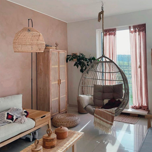
Dusty Pastels
To introduce colour without overwhelming the room, dusty pastels offer the perfect balance. Powder blue brings clarity, sage green recalls nature’s calm, and blush pink adds warmth without intensity.
Pastels also harmonise well with Aratamete’s luxury soft furnishings, complementing natural fabrics and handcrafted finishes, to infuse spaces with character while keeping the overall scheme light and expansive.
How to Use Colour in Soft Furnishings to Enhance Space

Curtains and Blinds
Curtains often set the visual frame of a room. For airier interiors, opt for light sheer curtains that gently filter sunlight, blurring the line between indoors and out. Pale-toned fabrics help reflect light while floor-to-ceiling designs add a sense of height.
Rugs and Carpets
The rug you choose grounds a space, but it doesn’t need to weigh it down. Opt for lighter tones to anchor without enclosing. Subtle, monochrome patterns like those found in our Zen Rugs also prevent visual clutter while adding quiet texture underfoot.
In open-plan layouts, pale rugs can delineate zones without fragmenting the overall sense of cohesion.
Upholstery
Large furniture pieces—sofas, headboards, armchairs—have a significant influence on the perceived weight of a room. Upholstering them in lighter shades ensures they enhance rather than crowd the space.
Accent cushions in soft, layered tones—like ivory with sage highlights or beige with dusty rose accents—allow colour to enhance the room while keeping it light and open.
Colour Pairings to Avoid Making a Space Feel Cramped
While bold contrasts can be compelling, they can also visually break up a room, making it appear smaller. If you wish to introduce bolder shades, balance them with ample neutrals.
For example, a deep velvet armchair feels grounded when set against soft beige curtains. The key is proportion and restraint, allowing intensity to be an accent rather than the dominant note.
Aratamete’s Approach to the Psychology of Colours
At Aratamete, colour is never an afterthought—it is an integral part of design. From curtains in luminous neutrals to handwoven rugs in soft gradients, our soft furnishings are designed with both atmosphere and longevity in mind.
Because every home is unique, we offer bespoke options, enabling you to tailor your interiors with intention. Our approach embraces the artistry of colour psychology—crafting spaces that not only look expansive but feel intuitively harmonious.
Transform Spaces Through Colour
Colour theory shapes not just the look, but the experience of a room. By using lighter tones, low-contrast palettes, and thoughtfully selected furnishings, the interior design ideas explored here can help you create homes that feel brighter, more spacious, and naturally inviting.
Aratamete’s collection of bespoke soft furnishings is crafted to bring these principles to life. Explore our collection today and discover how a thoughtful use of tone can open up your world.